How to create a simplified custom front page for TeamPage
 The other day, I helped a Japanese IT Support company build a client support site with TeamPage.
Their main request was to make the top page ("front page") of TeamPage simple as possible to be more welcoming and prevent clients from being confused. So, I (1) put the large icons and buttons on the top page and (2) removed tabs and sidebar etc.
In this blog post, I will briefly introduce how I did the customizations using a TeamPage plug-in developed and delivered to the company.
How? Why TeamPage?
Let me introduce how TeamPage allow us to build a client support site with private and public spaces.
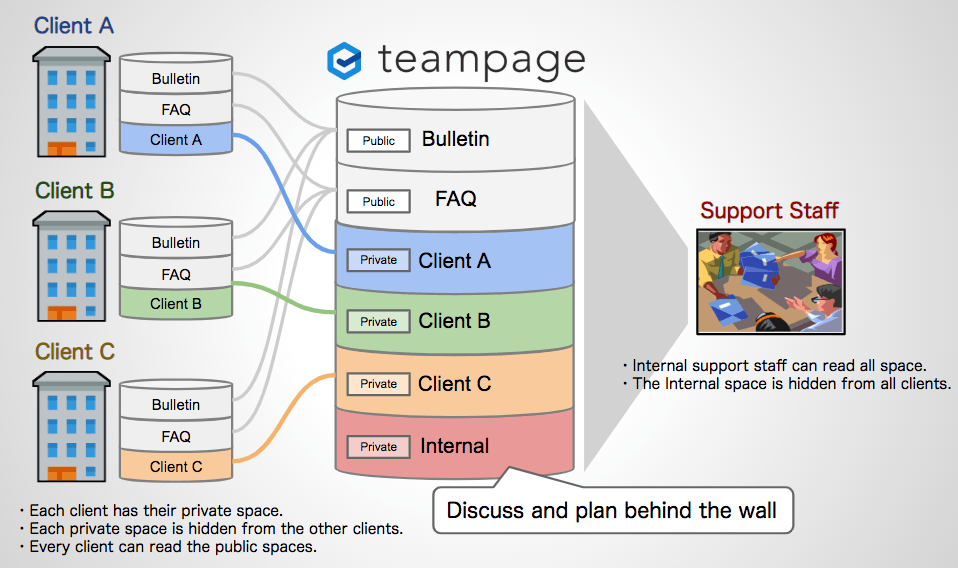
A "space" is like a "room" in a TeamPage building. An administrator is like a janitor of the building. He or she creates private rooms for clients who purchase IT support services from the company. The TeamPage server also has spaces for internal staff, and public spaces to post information shared with all clients and internal staff.
- A client can not enter the private rooms for the other clients.
- Internal support staff including the administrators can enter all rooms.
For example, the support requests, on-site remedy schedules, and the other articles and comments posted in the "Client A" room are allowed to be viewed by Client A only. They can not be seen by the other clients.
On the other hand, the internal staff has a high level overview of everything.
The company decided to start using TeamPage to build their support site because they had found Teampage as the best tool to manage the information security, track the latest situation for all clients, and research support records posted in the past by search.
Why We Simplify The Top Page
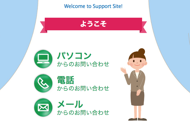
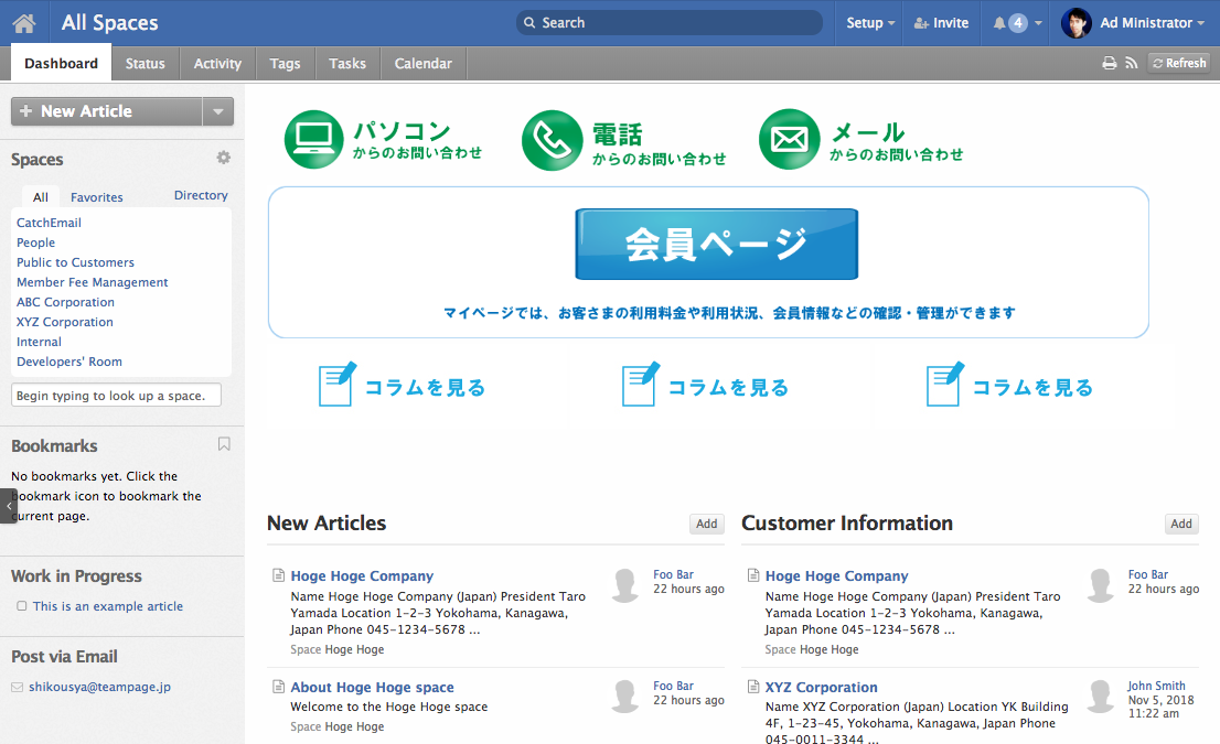
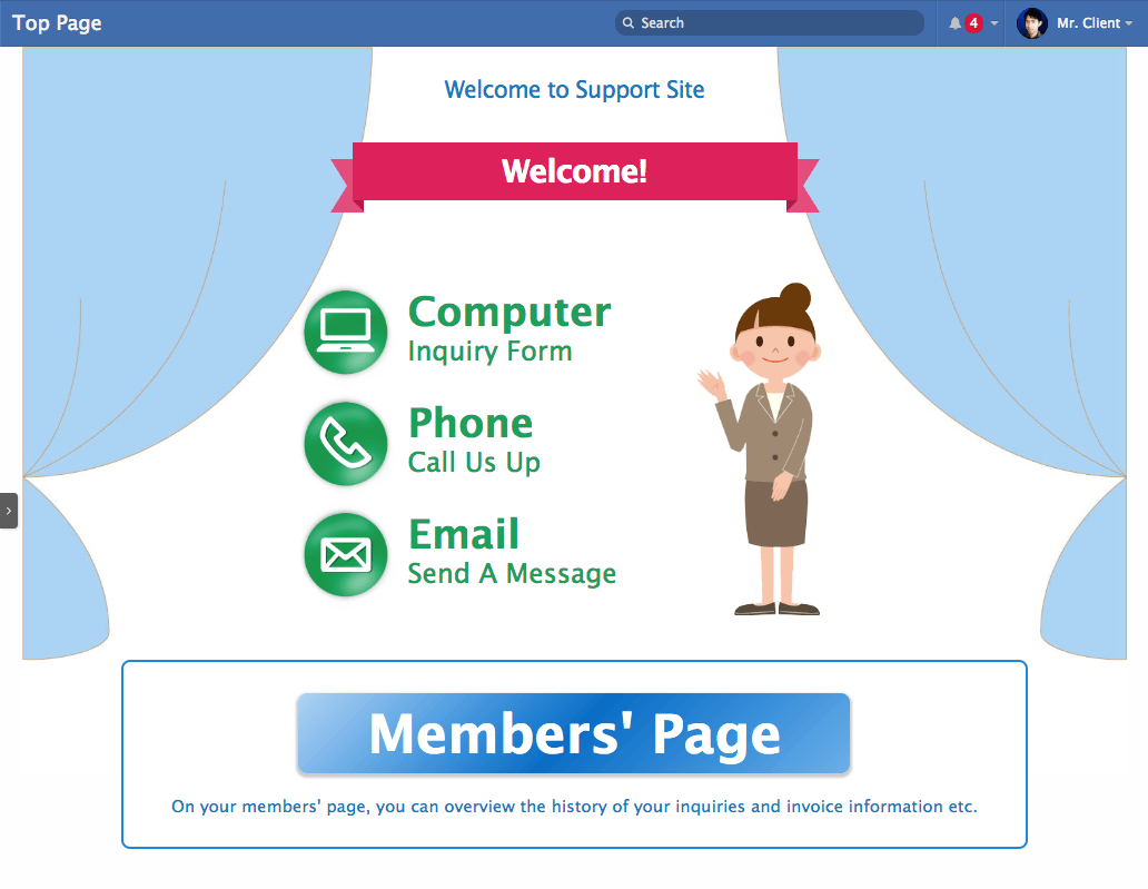
The top page before customization had the following interface.
- There were 3 green buttons, "Inquiry Form for PC", "Request via Phone", and "Request via Email".
- The buttons were embedded in an article and I put the article on the top page.
- The blue button "Go To Members' Page" was supposed to lead a client to his/her private space.
- The New Articles section showed the 5 newest article so that people could catch what was going on quickly on the top page.
- The Customer Information section showed the 5 newest articles with the "Customer Information" tag so that the internal staff can take a look quickly on the top page.
I thought this was simple enough and sufficiently refreshing, but my customer wanted me to simplify more and more. Their requests were;
- Let the clients understand "Go to the membership page first" and do not allow them to do other operations on the top page.
- Add attractive graphics including a fancy character. The top page with text and buttons does not look inviting and may turn off the clients.
TeamPage has lots of links and buttons on the page. This allows people to select their favorite ways to do an operation. One of them may do something by selecting a tab in the top navigation bar and another may do the same thing by clicking a link in the sidebar.
It's designed to be flexible. However, my customer didn't like it. He said "If there are several ways to get the same goal, people may be confused to choose one. They need only one way. Remove the unnecessary links and buttons as possible from the top page so that there will be only one way to get to the members' page."
I think this might be because of the difference of the educations in the U.S. and Japan. I've heard that the kids in the U.S. are taught to be independent, have their opinions, and make decisions. On the other hand, the kids in Japan are taught to follow the others to be a part of the teams first rather than express their opinions. Interesting, isn't it?
How to customize
Okay. Now let me introduce how I simplified the top page and made my customer happy.
Hiding the unnecessary parts
First of all, I had to hide unnecessary tabs and buttons as much as possible. Please see the animation shown below. I hid the black parts.
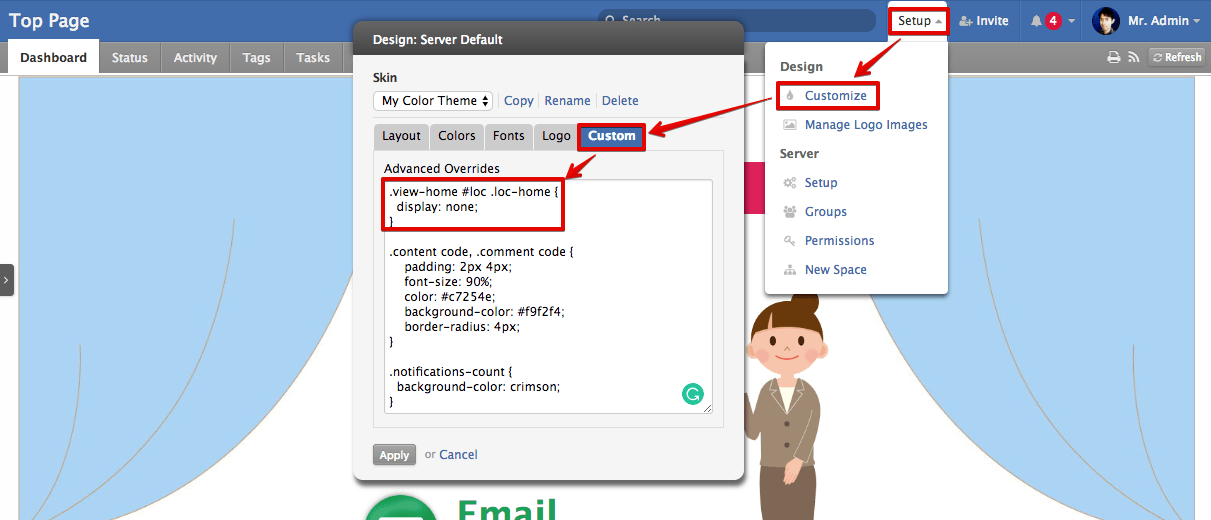
Home icon on the top-left
The "home" icon for returning to the top page is unnecessary on the top page because you are supposed to be already on the top page. I hid it by using the following stylesheet (CSS).
.view-home #loc .loc-home {
  display: none;
}
The stylesheet can be set on the "Design" dialog or Proteus Custom JavaScript & CSS plug-in.
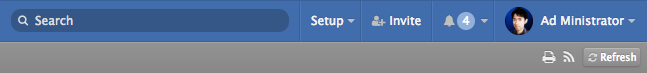
Setup and Invite menus
The "Setup" menu shows up only when a user logs in to TeamPage as an administrator. Since clients who post inquiries are not administrators, this menu will not be displayed. Therefore, customization is unnecessary.
The "Invite" menu shows up only when a user logs in to TeamPage with a user account with the "Invite" permission. This permission is allowed to everyone by default, so I configured the permission is allowed only to the administrators.
Tabs
The tabs in the header bar is a frequently-used navigation In TeamPage. You can switch the tabs by your needs. For example, if you want to the tasks and/or projects of your team, you should select the "Tasks" tab. If you want to check the due dates of the tasks and/or your meeting schedules, you should select the "Calendar" tab.
The tabs may be unnecessary for clients who are not familiar with TeamPage, but they are convenient and powerful navigation for those who are accustomed to TeamPage (such as administrators).
So, I decided to set up "to hide the tabs for clients and display the tabs for administrators".
The plugin-in that I recently created for this purpose is Set Special Class(es) to The HTML Body Tag plug-in which checks whether a logged-in user account belongs to a specific group and adds a special class(es) to the HTML <body> tag.
I set it up to add class="is-admin" to the <body> tag if a logged-in user belongs to the administrator group.
This allows me to display the tabs to the administrators only with the following stylesheet.
body:not(.is-admin) #sect-nav {
  display: none;
}
Sidebar
Hide/Show Side Column plug-in, which is installed by default, has an option which allows users to select collapse (hide) or expand (show) the sidebar by default. All I had to do was selecting "hide by default" there.
Sections
I disabled the sections in [Server Settings] > [Front page] configuration page. It was easy.
Coloring the notification badge
The notification badge tells you the number of your notifications. You receive a notification when someone comments on your post, someone changed the status of your task, someone posts an event (a schedule) with you as an attendee, and so on.
... but I wanted the badge to be noticeable by making its color red. The default color is lightened color of the background bar. Don't you think it is inconspicuous?
It was also easy to color the badge red. Just add the following CSS.
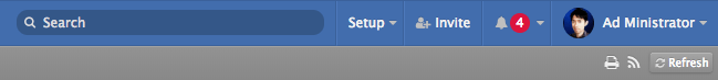
.menu-notifications .notifications-count {
  background-color: crimson;
}
A Fancy Character
I asked a web designer in the IT Support company to draw an image of the top page with a fancy character. Now, how do I put it on the top page of TeamPage?
TeamPage has (1) the "Embed Content" plug-in which allows me to put any HTML code in an article and (2) the "Dashboard" capability which allows me to display a specific article(s) on the top page. With the combination of the (1) and (2), I thought I could achieve the goal.
However, it turned out that there was a problem. Putting the green buttons and menus in the picture above is OK because the link target is fixed and the same for everyone but the destination of the "Members' Page" (the blue button) in the picture below must be different per client.
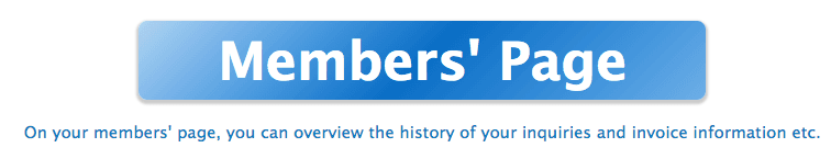
The "Members' Page" means "the dashboard page in the client's private space". So the blue button must navigate a user from the client "ABC Company" to the "ABC" room ("ABC" private space) and a user from the client "XYZ Company" to the "XYZ" room etc.
So I created a special small plug-in that checks the private space of a logged-in user and put the space name into the destination URL.
Each client user is supposed to have the read permission in his/her private space and some public spaces. The plug-in gets the list of the spaces where the user has the read permission and exclude the public spaces from the list.
<!--- Create a comma-separated list of the spaces where the user has the read permission,
      and put it into the "readableSpaces" variable. -->
<var.set name="readableSpaces">
  <projects.read>
    __project.name__
    <loop.last not>,</loop.last>
  </projects.read
</var.set>

<!--- Create a list of the public spaces
      and put it into the "publicSpaces" variable. -->
<var.set name="publicSpaces">Bulletin,FAQ,Forum</var.set>

<!--- Check each space in the list.
      If a space is in the public spaces list, do nothing. -->
<foreach list="${readableSpaces}">
  <compare.contains "${publicSpaces}" "__foreach.current__">
    <!--- Ignore! -->
  <else>
    <!--- Draw the blue button. -->
    <a href="/traction#/dashboard&proj=__foreach.current__">Members' Page</a>
  </compare.contains>
</foreach>
The programming language for TeamPage customization is called "SDL" (Skin Develop Language). It looks like HTML and XML. You can modify the existing behaviors and create new features just like you create a web page. If you are interested in the SDL programming, why don't you come to our support site? It's free!
After customization
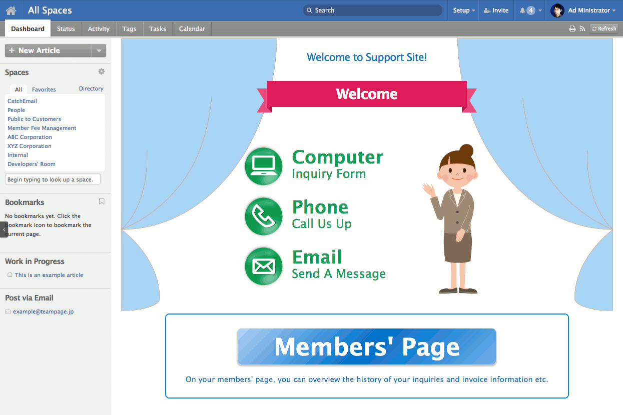
Ta-da! Finally, the top page customizations are done.
The IT Support company liked the simplified face of the top page. "It is quite simple and easy to understand! Customers will not get lost any more."
Summary
On the standard front page of TeamPage, you can arrange sections such as "New Articles" and "New Tasks" like a newspaper, or you can put a specific article on it like a poster.
In addition, you can change the landing page from the front page (the team-shared dashboard) to your own page.
Using JavaScript, CSS, and TeamPage's SDL programming language makes it possible to further customize.
The TeamPage plug-in architecture makes it simple to install the customization, and allows the company to install new TeamPage updates without having to re-install the plug-in.
One of the IT Support company said: "It was surprising and inspiring to me to know that TeamPage has such wonderful flexibilities and possibilities. I asked you many requests and you did never say "No, it is not supported." All our requests came to existence. Wonderful!" I was so glad to hear that!
If you are interested in customizing TeamPage, please feel free to contact us. You can learn to do this customization yourself, ask us for TeamPage SDK training and support, or ask us to design, deliver and support a plug-in extension to match what you want to do.
Related articles
Working Across Boundaries ... There's no reason to settle for a collaboration and action tracking solution that only handles internal collaboration, or assumes that everything happens in a building with glass walls and no doors. Real business value and sustainable competitive advantage often depend on working easily within and across boundaries that need to be in place to do business.
The Work Graph Model: TeamPage style ... A work graph consists of the units of work (tasks, ideas, clients, goals, agenda items); information about that work (relevant conversations, files, status, metadata); how it all fits together; and then the people involved with the work (who’s responsible for what? which people need to be kept in the loop?).
お客様が迷わない!スッキリ簡潔なトップページのカスタマイズ例 Japanese language version of this blog post, on the Traction Software Japanese Business Office website. Follow @TSIJPBO on Twitter for TeamPage news from Japan!
 I18N ERROR: @tsiskin#footer_RSS_Feed